Custom UI Template Kit
The Custom UI Template Kit is a digital asset containing out-of-the-box templates for UI customization. The kit is built around the defaultUITemplate custom UI and its dependencies, and provides UI customizations such as light/dark themes, responsiveness, header menus, footers, custom controls, and progress components for your forms, flows, or steps.
The digital asset is distributed by FintechOS via the Custom UI Digital Solution Package and contains the following main customization items:
| Customization Item | Type | Obs. |
|---|---|---|
| defaultUITemplate | Custom UI | Assign this custom UI to the form/flow/step you wish to customize. |
| defaultUITemplate.css | Style Sheet | Style sheet used by the defatultUITemplate custom UI. |
| journeyTemplateBuilder.js | Client Script Library | Library containing methods that facilitate working with the defaultUITemplate custom UI. |
Kit Components
The kit is an ongoing effort by FintechOS to help digital makers to easily design beautiful, modern, and responsive user interfaces. Some of the components available in the kit's initial iteration are listed below.
Mega Menu
Large customizable menu that allows you to add videos, images, and others.
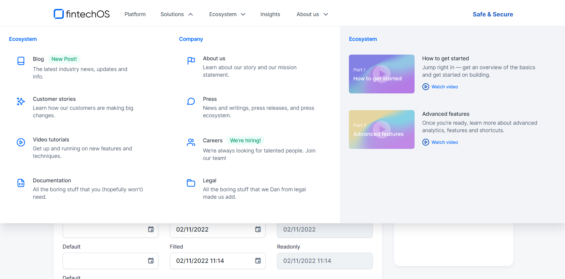
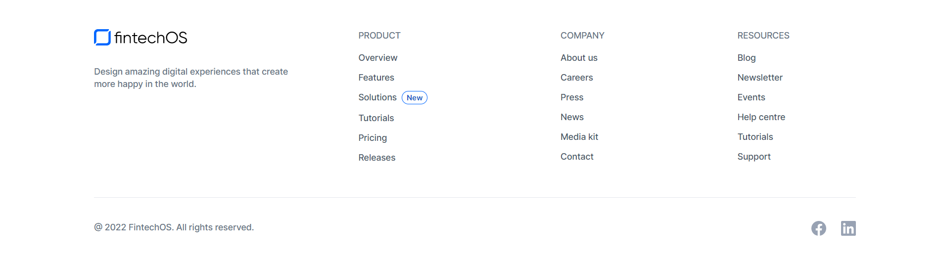
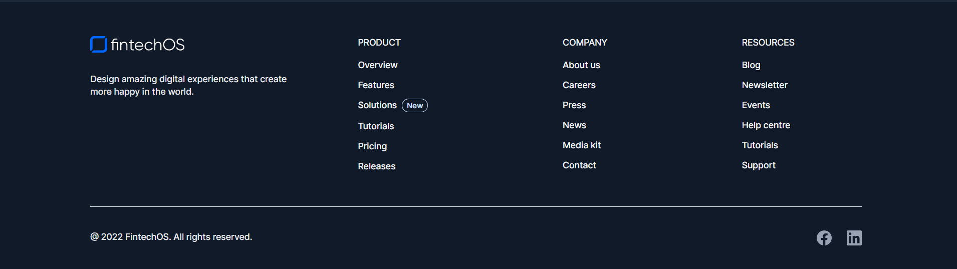
Mega Footer
This component allows you to display your legal, company, contact hyperlinks, and others.
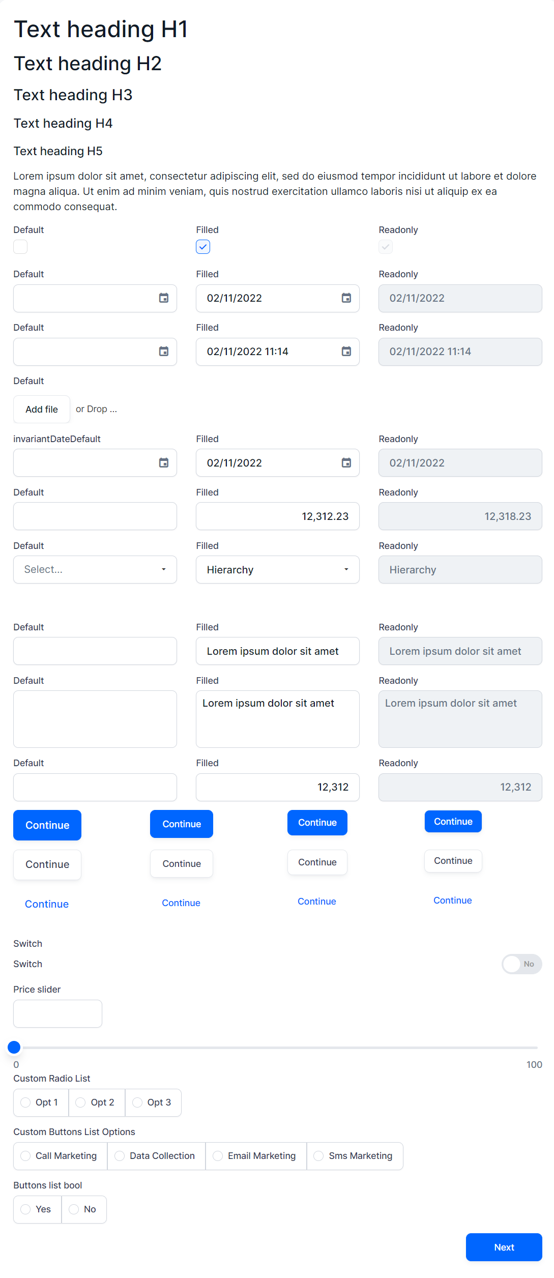
Modernized Default Controls and Custom Controls
A set of modern default UI components and custom controls, available for your form fields.
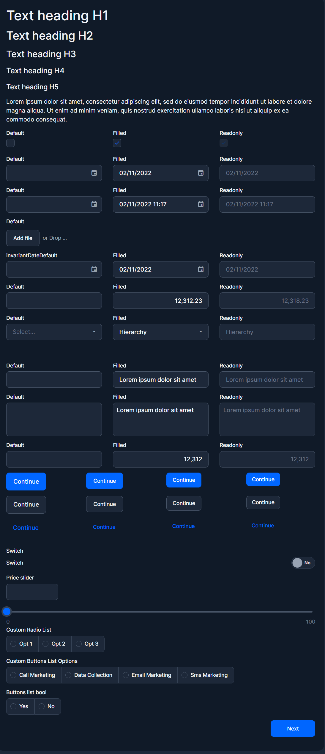
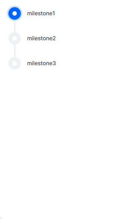
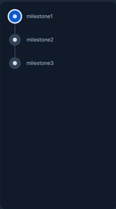
Progress Components
Track milestones in a flow's progression with progress bars or progress steps.
How to Use the Kit
1 Clone the Kit's Customization Items
The kit is regularly updated by FintechOS with improvements and additional components, therefore it is distributed as a sealed digital asset to insure its integrity. In order to customize it, you need to clone the defaultUITemplate custom UI and its dependencies:
- Clone the journeyTemplateBuilder.js client script library.
- Clone the defaultUITemplate.css style sheet.
- Clone the defaultUITemplate custom UI.
- Update the cloned custom UI dependencies:
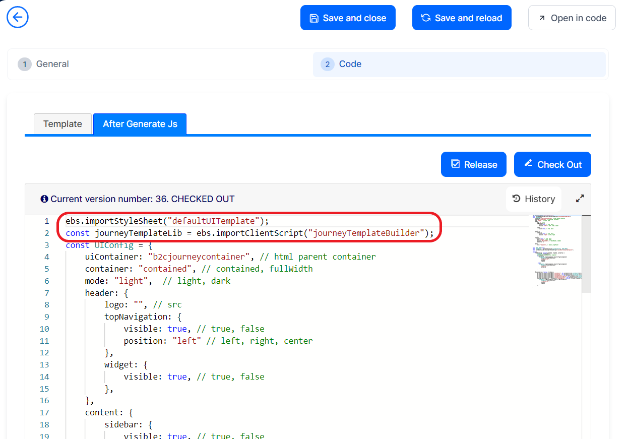
- Open the custom UI you cloned earlier in the editor.
- Select the Code tab.
- Select the After Generate Js subtab.
- Check Out the After Generate Js script.
- Update the imported style sheet and client script library with the clones you created earlier.

- Click Save and Close.
2 Assign the Template Custom UI to the Form/Flow/Step You Wish to Customize
- Open the form/flow/step you wish to customize in the editor.
- Select the Advanced tab.
- In the Set Custom UI drop-down, select the custom UI clone you created earlier (based on defaultUITemplate).
3 Customize the UI
Once you have cloned the custom UI, you can customize its settings:
- In FintechOS Studio, go to Main Menu > Digital Experience > Digital Frontends > Custom UI.
- Double click the custom UI clone you created earlier (based on defaultUITemplate).
- Select the Code tab.
- Select the After Generate Js subtab.
- Check Out the After Generate Js script.
- In the code, go to the UIConfig constant and edit the corresponding settings. E.g.:Copy
const UIConfig = {
    uiContainer: "b2cjourneycontainer", // html parent container
    container: "contained", // contained, fullWidth
    mode: "light",  // light, dark
    header: {
        logo: "", // src
        topNavigation: {
            visible: true, // true, false
            position: "left" // left, right, center
        },
        widget: {
            visible: true, // true, false
        },
    },
    content: {
        sidebar: {
            visible: true, // true, false
            position: "right" // left, right
        },
    },
    progress: {
        visible: true, // true, false
        style: "steps", // bar, steps
        position: "sidebar", // belowHeader, sidebar
        dataSource: []
    },
    footer: {
        style: "megaFooter", // default, megaFooter
    }
} - Click Save and Close.
4 Customize the Progress Component
To customize the progress component, you need to define the milestones that will be displayed in the progression and to map those milestones to the various steps in your form/flow.
- In FintechOS Studio, go to Main Menu > Advanced > Client Script Libraries.
- Double click the client script library clone you created earlier (based on journeyTemplateBuilder).
- Check Out the library's code.
- In the code, go to the milestones constant and edit the corresponding milestones.Copy
const milestones = [
        "milestone1",
        "milestone2",
        "milestone3",
        "milestone4",
        "milestone5"
] - Go to the milestoneMapperObj constant and map the milestones to the desired steps (you can map your milestones to steps from multiple forms/flows).Copy
const milestoneMapperObj = {
        "formdrivenName1": {
            "step1": "milestoneForStep1",
            "step2": "milestoneForStep2"
            .
            .
            "stepN": "milestoneForStepN"
        },
        .
        .
        "formdrivenNameN": {
            "step1": "milestoneForStep1",
            "step2": "milestoneForStep2"
            .
            .
            "stepN": "milestoneForStepN"
        },
        "customflowName1": "milestoneForCustomFlow1",
        .
        .
        "customflowNameN": "milestoneForCustomFlowN"
} - Click Save and Close.
5 Customize the Mega Menu
To customize the mega menu, you need to define the items and sections that will be displayed in the menu.
- In FintechOS Studio, go to Main Menu > Advanced > Client Script Libraries.
- Double click the client script library clone you created earlier (based on journeyTemplateBuilder).
- Check Out the library's code.
- In the code, go to the menuOptions constant and edit the corresponding menu settings. E.g.:Copy
const menuOptions: {
  dataSource: [
      {
          text: "Menu item 1"
      },
      {
          text: "Menu item 1",
          items: [
              {
                  icon: "<i class='dx-icon-menu'></i>",
                  text: "Sub item 1"
              },
              {
                  icon: "<i class='dx-icon-menu'></i>",
                  text: "Sub item 2"
              }
          ]
      },
      {
          text: "Menu item 2",
          megaMenu: [
              {
                  sectionName: 'Section 1',
                  items: [
                      {
                          icon: "<i class='dx-icon-menu'></i>",
                          text: "Mega menu item 1",
                          description: "Mega menu item 1 description"
                      }
                  ]
              },
              {
                  sectionName: 'Section 2',
                  emphasized: true,
                  items: [
                      {
                          icon: "<i class='dx-icon-menu'></i>",
                          text: "Mega menu item 2",
                          label: "First Mega menu",
                          description: "Mega menu item 2 description"
                      }
                  ]
              }
              ]
      }
  ],
  showSubmenuMode: "hover",
  onItemClick: (e) => { console.log(e.item.text)},
} - Click Save and Close.