STEP 4. Working with Buttons
Button are added from the left side of the screen named ''Components'' by clicking and dragging the button itself to the row where the button is to be placed in a row container.
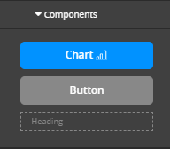
Chart
Pre-existing charts can be added to a form driven flow by dragging the button from the left-side of the panel called Data Templates to the template.
- Access the entity form or a Form Driven Flow, in the UI section, select UI Designer.
- In Data Templates, under the Components collapse, select the button named Charts with an indicative icon.
- Drag and drop the Charts button in the middle section of the screen, the chart placeholder appears.
- Click the placeholder to open the right section with a dropdown list with all the existing charts in the database.
- Select the desired chart and click ''Apply'', then ''Update template''. The placeholder has the name of the selected chart.
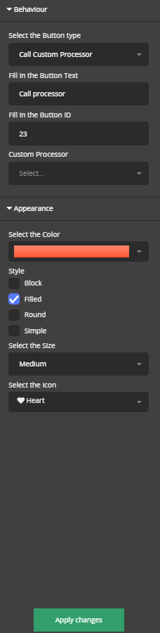
The right side of the screen the panel with the following configurations opens:
| Field | Description |
|---|---|
|
Select button type |
Select one of the options:
|
|
Fill in the button text |
Write the words to be displayed on the button for the user to read. |
| Fill in button ID | Unique name used to identify the button internally. |
|
Appearance |
|
|
Select the button color |
Select one of the available colours. |
|
Style |
Tick one of the options:
|
|
Select the size |
Select one of the options:
|
| Select the icon | The text that will be shown on the button in the user interface. |
Depending on the chosen type of button new fields will open.
Form Actions Buttons
These buttons allow you to trigger one or more form actions defined in the form. For details, see Defining Form Actions.
| Field | Description |
|---|---|
|
Select button type |
Select one of the options:
|
|
Fill in the button text |
Write the words to be displayed on the button for the user to read. |
| Fill in button ID | Unique name used to identify the button internally. |
|
Select the Form action |
Select the form action configured before. |
|
Navigate to next step |
If the action is triggered, and the result is true, tick the navigation to the next step. |
| Fill in the Form Actions Message |
Once the action is triggered, display this message. |
|
Appearance |
|
|
Select the button color |
Select one of the available colours. |
|
Style |
Tick one of the options:
|
|
Select the size |
Select one of the options:
|
| Select the icon | The text that will be shown on the button in the user interface. |
Call Custom processor button
Fill in the following fields, to add a customer processor triggering button in the UI of a digital journey or an entity view.
| Field | Description |
|---|---|
|
Select button type |
Select one of the options:
|
|
Fill in the button text |
Write the words to be displayed on the button for the user to read. |
| Fill in button ID | Unique name used to identify the button internally. |
|
Select the Custom processor |
Select the custom processor configured before. |
|
Appearance |
|
|
Select the button color |
Select one of the available colors. |
|
Style |
Tick one of the options:
|
|
Select the size |
Select one of the options:
|
| Select the icon | The text that will be shown on the button in the user interface. |
Endpoint Buttons
These buttons allow you to call a predefined endpoint. For details, see Creating Endpoints.
| Field | Description |
|---|---|
| ID | Unique name used to identify the button internally. |
| Label | The text that will be shown on the button in the user interface. |
| Endpoint | The name of the endpoint you wish to call. |
|
MAP INPUT PARAMETERS |
Select the input parameter an attribute where to mat the data. |
|
MAP OUTPUT STRUCTURE |
Select the output parameter an attribute where to mat the data. |
Custom Buttons
These buttons do not have any predefined behavior and must be configured using HTML elements or DevExtreme widgets.
Once you click the Add button, the form step's After Events section is opened automatically allowing you to configure the button's behavior. The section is pre-populated with a placeholder on-click event code.
/* Click event for the test button */
$('#test').on('click', function (event) {
    console.log("The button test was clicked");
});
You can modify the existing code or replace it completely with custom code, for instance using DevExtreme widgets:
eventHandler $("#test").dxButton({
    text: "Click me",
    onClick: function()
        {
            alert("Button clicked");
        }
});
When removing a button from the template, the corresponding on-click event in the After Events tab will not be removed, as it might be useful in case you accidentally delete the button.
 Example: Creating a Search Customer button
This example describes how to add a Search Customer button on a simulated digital journey for unsecured loan applications. This enables agents to check if a customer applying for a loan is an existing customer and if so, get the customer’s information from the database and auto-fill in specific customer information. This example presents how to add the custom button using HTML elements.
Prerequisite: In FintechOS Studio, a form driven flow has been created and customized to serve the simulation of unsecured loan applications. The journey has been configured to allow bank agents to simulate unsecured loan applications.
To add a custom button that performs a custom action on user click, follow these steps:
- Go to the configuration page of the Customer Info section . By default, it is displayed on the General tab.
- Click the UI tab.
- On the HTML Editor toolbar, from the Tools menu , select <> Source code. The Source code pop-up appears.
- Add the div elements for PIN field and the Search Customer button, as follows:
- Click OK. The pop-up closes.
- Click the Advanced tab, then the After Events tab and add the click event handler for the button:
- Save the changes by clicking Save and close at the top-right corner of the configuration page.
<div class="row col-lg-12 col-md-12 col-sm-12 col-xs-12" style="margin: 20px; background-color: white; border: solid 1px #E0E0E0; width: 90%;">
    <h3 style="font-family: Ubuntu; font-size: 17px; color: #662d91; font-weight: 500; margin-left: 15px; margin-bottom: 0.5rem; margin-top: 30px; letter-spacing: 2.4px; line-height: 1.2; text-transform: uppercase;">Already our customer?</h3> >
    <div id="searchPIN" class="panel-body">
        <div class="col-lg-4 col-md-4 col-sm-12 col-xs-12" style="color: #333333;">Please check it out. It takes less than 1 minute.</div>
        <div class="col-lg-4 col-md-4 col-sm-12 col-xs-12">
                <input id="inputSearchPIN" class="form-control" type="text" placeholder="Search PIN..." />
        </div>
    <div class="col-lg-4 col-md-4 col-sm-12 col-xs-12 "><span class="input-group-btn"> <button id="getPersonalData" class="btn btn-azure" style="pading-left: 15px;" type="button"> Search Customer</button></span></div>
    </div>
</div>// Search Customer by PIN
$('#getPersonalData').click(
function() {
var PIN = $("#inputSearchPIN").val();
ebs.getByQuery(
{
"entity": {
"alias": "a",
"name": "Account",
"attributelist": [
{"name":"Accountid"},
{"name":"LastName"},
{"name":"FirstName"},
{"name":"UniqueID"},
{"name":"DateOfBirth"},
{"name":"PlaceOfBirth"},
{"name":"Age"},
{"name":"IdCardNo"},
{"name":"IdCardSeries"},
{"name":"IdCardIssuedBy"},
{"name":"IdCardIssueDate"},
{"name":"IdCardExpiryDate"},
{"name":"GenderId"}
]
},
"where": {
"type": "and",
"conditionlist": [
{
"first": "a.PIN",
"type": "equals",
"second": "val(" + PIN + ")"
}
]
}
},function(e){
if(e.Records.length > 0){
ebs.setFormAttributeValue("ebsContainerContent", "LastName", e.Records[0].a_LastName);
ebs.setFormAttributeValue("ebsContainerContent", "FirstName", e.Records[0].a_FirstName);
ebs.setFormAttributeValue("ebsContainerContent", "PIN", e.Records[0].a_UniqueID);
ebs.setFormAttributeValue("ebsContainerContent", "BirthDate", e.Records[0].a_DateOfBirth);
ebs.setFormAttributeValue("ebsContainerContent", "BirthPlace", e.Records[0].a_PlaceOfBirth);
ebs.setFormAttributeValue("ebsContainerContent", "Age", e.Records[0].a_Age);
ebs.setFormAttributeValue("ebsContainerContent", "IDNumber", e.Records[0].a_IdCardNo);
ebs.setFormAttributeValue("ebsContainerContent", "IDSeries", e.Records[0].a_IdCardSeries);
ebs.setFormAttributeValue("ebsContainerContent", "IDIssuedBy", e.Records[0].a_IdCardIssuedBy);
ebs.setFormAttributeValue("ebsContainerContent", "IDValidFrom", e.Records[0].a_IdCardIssueDate);
ebs.setFormAttributeValue("ebsContainerContent", "IDValidTo", e.Records[0].a_IdCardExpiryDate);
}
else{
ebs.showMessage("The customer was not found in our database. Please proceed to OCR.", "warning");
ebs.setFormAttributeValue('ebsContainerContent', 'LastName', null);
ebs.setFormAttributeValue('ebsContainerContent', 'FirstName', null);
ebs.setFormAttributeValue('ebsContainerContent', 'BirthPlace', null);
ebs.setFormAttributeValue('ebsContainerContent', 'BirthDate', null);
ebs.setFormAttributeValue('ebsContainerContent', 'Age', null);
ebs.setFormAttributeValue('ebsContainerContent', 'BirthDate', null);
ebs.setFormAttributeValue('ebsContainerContent', 'IDNumber', null);
ebs.setFormAttributeValue('ebsContainerContent', 'IDSeries', null);
ebs.setFormAttributeValue('ebsContainerContent', 'IDIssuedBy', null);
ebs.setFormAttributeValue('ebsContainerContent', 'IDValidFrom', null);
ebs.setFormAttributeValue('ebsContainerContent', 'IDValidTo', null);
ebs.setFormAttributeValue('ebsContainerContent', 'PIN', $("#inputSearchPIN").val());
}
});
});This is what the bank agent will see in the Digital Experience Portal:
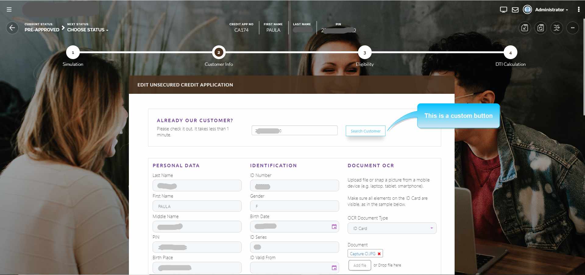
To check if the customer is an existing customer, the agent will provide the PIN and click the Search Customer button. If the PIN exists in the database, the customer's Personal Data is automatically filled-in.