Use UI components (buttons, headings, paragraphs, widgets)
The Components section in the left panel of the UI designer allows you to add static or interactive elements that are not related to the workflow's data domain to the user interface. These elements include buttons, headings, paragraphs, and widgets.
To add a component to the interface, drag and drop it from the left panel to the editor's working area (see Adding UI elements to the user interface).
Button
To add a button to the user interface:
- From the left panel, drag the button component to the desired position in the UI.
- Use the right panel to configure the button's properties:
-
Click Apply changes.Property Description Behaviour
Select the Button type Notify Event - Button that triggers a custom event (e.g. that can be handled via the formData.registerEvent method or Workflow Logic Blocks).
NOTE
The Default Next and Back Buttons trigger two system events: journeyGoNext which navigates to the next step and journeyGoPrevious which navigates to the previous step in the workflow respectively. These events are hard-coded. You can customize or remove these buttons as needed.Fill in the Button Text Enter the text for the button label.
You can also add translations for each platform language, by clicking the translation icon.Fill in the Button ID Enter an HTML ID for the button. Resource key name Name of the resource key that designates the button label localizations in the Localization Resources page.
This key is generated automatically based on the button ID.Fill in the Custom Event Name
(Notify Event buttons only)Name of the custom event the button will trigger. HINT
You can use Custom Event triggers in your Workflow Logic Blocks or the formData.registerEvent method to configure event handlers for your buttons.Appearance
Select the Color Choose a color for the button. Style Choose the button styling: - Block - The button to occupies the entire width of its container.
- Filled - The button color is applied to the entire button, not just the edges.
- Round - The margins of the button are rounded.
- Simple - The button shape is not visible, only its text label is displayed. Not compatible with Filled and Round.
Select the Size Select the size of the button label's text. Select the Icon Select an icon to be displayed before the button label. Additional CSS classes Add the names of the classes you wish to attach to the button's HTML element (e.g.: a styling class defined in one of the Style Sheets applied to the workflow).
NOTE
You must press Space or Enter after typing a class name to confirm it. - Click Update template.
Heading
Headings separate and label the various sections in your user interface. To add a heading to the user interface:
- From the left panel, drag the heading component to the desired position in the UI.
- Use the right panel to configure the heading's properties:
-
Click Apply changes.Property Description Select Heading Type Select the type of heading from H1 through H5. Enter the desired text Enter the text for the heading field.
The text can include tokens to be replaced with attribute values at runtime (see Insert Attribute Tokens in Headings and Paragraphs).
You can also add translations for each platform language, by clicking the translation icon.Enter the resource key name that will store the localizable text Choose a name for the resource key that will save this heading in the Localization Resources page. Select the text alignment Select to align the heading left, center, or right. Additional CSS classes Add the names of the classes you wish to attach to the heading's HTML element (e.g.: a styling class defined in one of the Style Sheets applied to the workflow).
NOTE
You must press Space or Enter after typing a class name to confirm it. - Click Update template.
Paragraph
Paragraphs are static blocks of text displayed in your user interface. To add a paragraph:
- From the left panel, drag the paragraph component to the desired position in the UI.
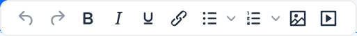
- Click the paragraph to insert the desired text. A pop-up toolbar allows you to format the text.
The text can include tokens to be replaced with attribute values at runtime (see Insert Attribute Tokens in Headings and Paragraphs).
NOTE
When inserting an image in the UI, the URL must be in the form:custom\picture_name.jpeg, wherecustom\is the name of the custom folder, andpicture_name.jpgis the name and extension of the image file. Add width and height to make the image visible in the Workflow UI Designer.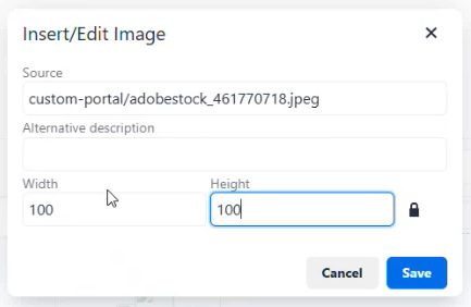
- Use the right panel to configure the paragraph's properties:
Property Description Enter the resource key name that will store the localizable text Choose a name for the resource key that will save the paragraph text in the Localization Resources page. Select the text alignment Select to align the paragraph text left, center, or right. Additional CSS classes Add the names of the classes you wish to attach to the paragraph's HTML element (e.g.: a styling class defined in one of the Style Sheets applied to the workflow).
NOTE
You must press Space or Enter after typing a class name to confirm it. - Click Apply changes.
- Click Update template.
Widget
To add Widgets to the user interface:
- From the left panel, drag the widget component to the desired position in the UI.
- Use the right panel to configure the widget's properties:
-
Click Apply changes.Property Description Select the Widget Select the desired widget you wish to display. Additional CSS classes Add the names of the classes you wish to attach to the widget's HTML element (e.g.: a styling class defined in one of the Style Sheets applied to the workflow).
NOTE
You must press Space or Enter after typing a class name to confirm it.Widget identifier Allows you to assign an ID to the HTML element where the widget is displayed. Hide widget title Does not display the widget title. - Click Update template.
Insert Attribute Tokens in Headings and Paragraphs
Tokens are attribute placeholders you can include in your headings or paragraphs. At runtime, these tokens are replaced with actual attribute values in the user interface. To insert an attribute token:
- Make sure that the attribute is included in the Screen Exposed Data.
- In the Workflow UI Designer, select the desired heading or paragraph.
- In the heading or paragraph's text, type the token encased in double curly brackets at the location where you want to insert the attribute value. E.g.: Hello {{first name}}.
Adding a token activates the Advanced Configuration section in the heading/paragraph's settings panel. - In the Advanced Configuration section, click Edit to configure the token.
- Select the Attribute you want to use to populate the token.
- Optionally, you can customize how the attribute value is displayed using the Format field. Formatting options depend on the attribute's data type. E.g.:
Data Type Format Value Output Date dd-MM-yy 2023-09-25 25-09-23 Number ###,###,#0 1234567 123,456.70 Boolean yep|ney true yep Text **-** ** myText my-Te xt
- Click Apply.
- Click Apply Changes.
- Click Update Template.