Design the UI layout with containers
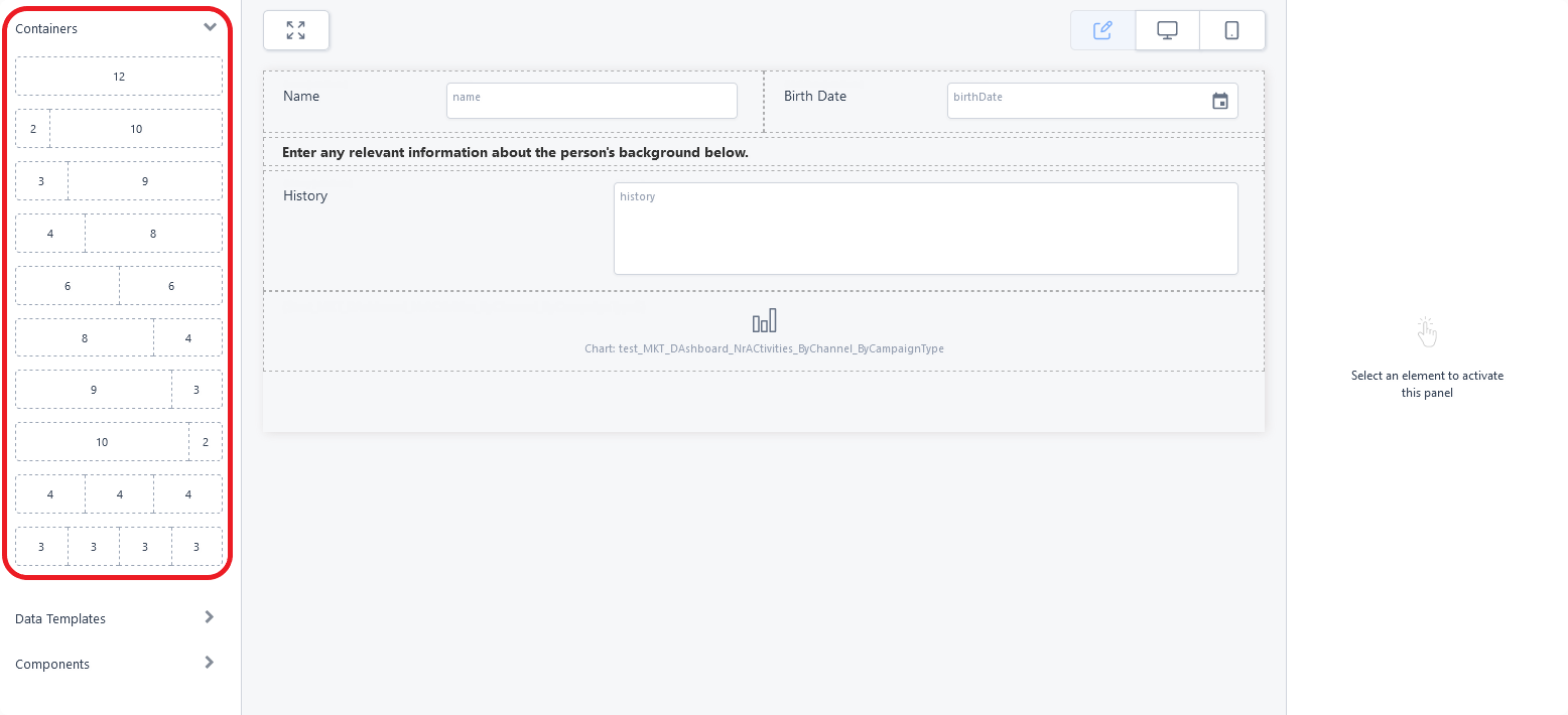
You can use the Containers in the UI Designer's left panel to position the content in each form section (row) using responsive design. Each container is divided based on a grid of 12 columns that are grouped together in various combinations to create wide or narrow cells (three 4-column cells, a 3-column cell next to a 9-column cell, two 6-column cells, etc.).
To add a row template to the interface, drag and drop its corresponding container from the left panel to the editor's working area (see Adding UI elements to the user interface). Each cell of the template allows you to place data fields, UI components, or even other row templates to further refine your page layout.
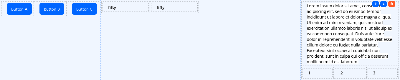
Cells on the same row template are responsive, which means they appear on the same line on desktop devices, but are rearranged one on top of the other on mobile devices. Empty cells take up space in desktop (horizontal) mode, but are collapsed in mobile (vertical) mode.

vs.