Charts
Charts are visual presentation of data that help you convey information, and understand data in a visual way.
By using charts, data in your report is displayed in a clear way allowing you to easily compare sales figures or highlighting a trend.
Use charts when a tabular report won't adequately show relationships between data points.
Creating charts
Prior to creating charts, think about the outcome that you want to achieve, or the specific data that you want to show. Make your charts simple to keep your audience focused on relevant information and avoid any confusion.
Follow the steps below to add a chart:
- From the main menu, click Analytics > Charts. The Charts List page appears.
- At the top-right corner if the page, click the Insert icon. The Add Chart page appears.
- Configure the chart by providing the attributes:
- Standard - represents a Name/Value series on the X/Y axes. For example, income= 20k, education=high school.
- Series - represents more series from a given fetch. For example, client Paul Mathew: income=15k, education=undergraduate. When you have a third variable it is suitable to use series.
- bar - displays rectangular bars. Use bar charts to present or compare data from the same category, e.g., the sales value or product volume over a period of time.

- line - displays a two-dimensional scatter-plot of ordered values connected by lines following their order. Use lines charts to display the relationship between multiple sets of data over a period of time.

- Pie - displays percentage values as a slice of a pie. Use pie charts to focus on the big picture, drawing attention to important information.

- doughnut - similar to pie charts, this type of charts have a number of elements including the division of segments and the meaning of arc for an individual segment. It is useful to present the relationship between proportions of different data groups.

- spline - similar to line charts, the spline chart has data points connected with smooth curves instead of straight lines. It usually display the change of a variable over time (in Cartesian charts) or simply along the X-axis (for Scatter charts). Spline charts are the basis for spline area charts.
- scatter - allow analyzing how different goals have been achieved around a main topic and their different dimensions over a time period. For example, compare types of products based on budgets and selling prices.

- area - similar to line charts, they have solid plot lines. They're useful for displaying trends over a period for single or several categories, or the change between several data groups.

- spine area - an area chart in which data points are connected by smooth curves. The area between the line segments and the X-axis is colored to emphasize the magnitude of change over time.
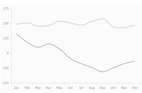
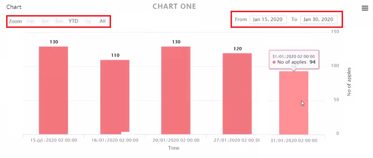
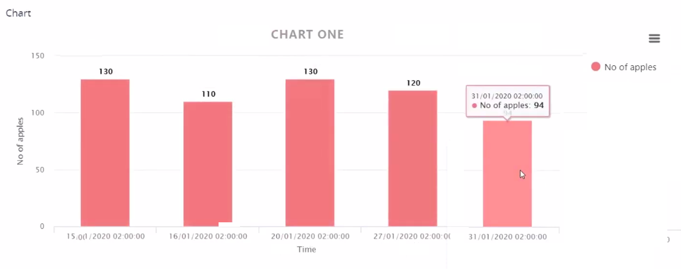
- Save the changes by clicking the Save and close icon. If you want to see how the chart looks like, click the Save and Reload icon and scroll down to the Chart section which displays the chart. The figure below shows an example of a standard bar Finchart which is not rendered as time series:
| Chart Attribute | Description |
|---|---|
| Name | The chart name used by the system. |
| Chart Title | The chart name that will be displayed in the Digital Experience Portal. |
| Chart Base Type | Two options are available: |
| Chart Type | Select one of the following options from the drop-down: NOTE For base charts of type series, the following chart types are not available: pie and doughnut. |
| Name field | Alias used in the fetch which maps the name on X axis. |
| Value field | Alias used in the fetch which maps the value on the Y axis. |
| Series argument field | The pairing of an argument and its value are represented on a diagram's axes as their X and Y coordinates. This field holds the third. For example, this would be the client variable. |
| Show legend | Tick to display data about the datasets that appear on the chart. You can choose where you want the legend to be shown on the chart: Legend horizontal alignment (left, right or center) and Legend vertical alignment (top or bottom). |
| Show labels | Tick to add data labels to the data points of the chart. Labels help you quickly identify data series in a chart. |
| Override Color | Change the default rendering color of the chart. |
| Axis X Title | The title to be displayed on the chart's X axis. |
| Axis Y Title | The title to be displayed on the chart's Y axis. |
| Render Type | The chart rendering type: Chart or Finchart. |
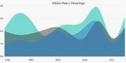
| Render As Time Series | Tick to render chart values over a period of time. It enables you to zoom in/out chart data per time intervals (1 month, 3 months, 6 months, year, or all) and also filter the data within specific from - to dates. The figure below presents a standard bar Finchart rendered as time series:
|
| Container CSS Class | The name of the css class to add to the graphic container. |
| Container CSS Inline Style | The css changes you want to apply to the chart. |
| After Generate Js | JavaScript code to be executed after the chart is rendered. |
| Fetch expression return object | Returns the fetch data for the chart. |
There are various ways in which you can render charts:
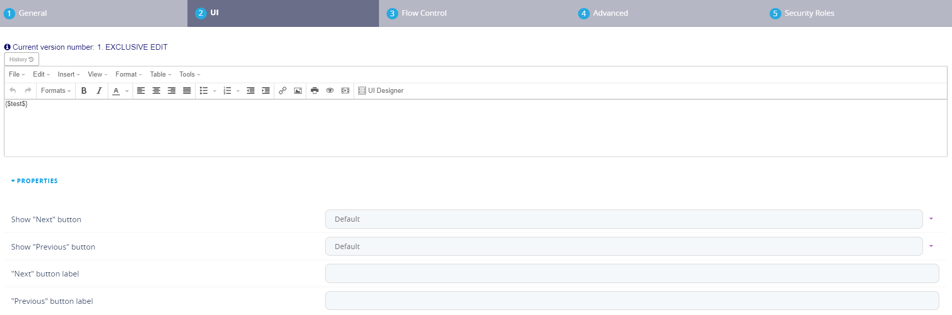
- on forms by using the token {$chartName$}. By creating a form driven flow (see Form Driven Flows), and in the Steps tab, create the step you wish to insert the chart in e.g. Step 4 and in the UI tab insert the token with the name of the chart created. Click the Save and close button. Display the shortcut for the Digital Journey in a dashboard and navigate to Step 4 to see the chart.
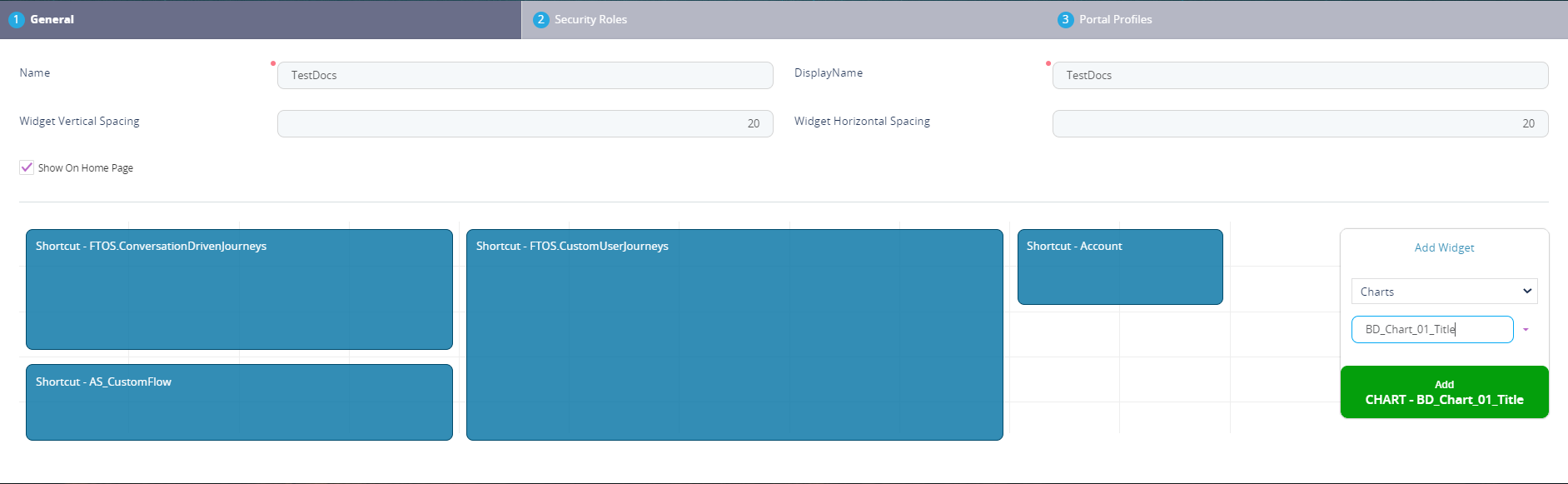
- add charts to Digital Experience Portal dashboards. Go to the desired dashboard and select the charts widget select the name of the chart and click on ''Add xyz'' chart as shown below.
- programmatic by using the ebs.generateChart method. For details, see ebs.generateChart in the Client SDK user guide.