Replace the Default HTML Controls with Custom Controls
The HTML controls used to display entity attributes in the user interface are based on the attributes' types. For instance, text and numeric attributes are rendered using text boxes, boolean attributes are rendered as checkboxes, while option sets and some lookups are rendered using dropdowns.
However, depending on your styling requirements, you can override the default controls that render various attributes with your own custom controls. For instance, you may want to use a slider for a numerical attribute or a toggle for a boolean attribute.
To set up a custom control for an entity attribute, you need to:
- Create an interceptor class function that renders a type of custom control.
- Associate the desired entity attribute with the interceptor, so that the attribute is rendered using the interceptor instead of its default control.
Create an Interceptor
An interceptor is a function that allows you to define how an attribute is rendered. Since interceptors are called to render attribute values, they must replicate the properties and methods of the attribute's default HTML controls:
{
  render: (htmlId: string, attr: any) => void;
  setValue: (
    htmlId: string,
    value: any
  ) => void;
  getValue: (htmlId: string) => any;
  setReadonly: (readonly: boolean) => void;
  getReadonly: () => boolean;
  addChangeHandler: (handler: Function) => void;
  validateRequired: () => { isValid: boolean; erroredProps: string[] };
  hasOwnRequireValidator: () => boolean;
  requiredLevel: any;
}| Method | Description |
|---|---|
render
|
Sets up the UI for the control. Receives the htmlId of the container where the control will be mounted and the name of your attribute. |
setValue
|
Sets the value of the control. Receives the htmlId of the container where the control will me mounted and the value of your attribute. |
getValue
|
Retrieves the control's value. Receives the htmlId of the container where the control will be mounted. |
setReadonly
|
Determines if the control is readonly or not. Receives a boolean parameter. |
getReadonly
|
Returns if the control is readonly or not. |
addChangeHandler
|
Registers a change handler event. Receives the event function. |
validateRequired
|
Used on form saving events. If requiredLevel is set to 2, especially for more complex use cases, it returns an isValid boolean and an array of errors in the erroredProps string. |
hasOwnRequireValidator
|
Indicates if the required property should be used or not based on a run time decision. Returns a boolean value: if it returns true, the required level set on the interceptor will be used. |
requiredLevel
|
Attribute's required level:
|
A Custom Control Library with several interceptors is included by default in FintechOS Studio. If you want to create your own custom controls, you need to create a dedicated client script library for your interceptors. Make sure your interceptors implement all the above methods, using the custom control library as a model.
If you use third-party controls libraries to create interceptors, additional options may be available for various controls. To populate these options, all interceptors in the custom control library have a function called
setOptions that lets you set all the properties available for such a control type.Example: Custom Switch Based on the DevExtreme Library
In this example, we describe a custom switch interceptor that is included in the Custom Control Library. The switch is based on the DevExtreme controls library. The interceptor function stores all the options properties (like value, label, extra, onText, and offText), as well as the readonly property, the array of change event handlers, and some references to our controls and DOM nodes (label, extra label, and the switch from the DevExtreme third-party library).
The render function builds up the UI and mounts it in the page, using the htmlId of the container provided by the platform. setValue sets the value on the class function and on the switch, and getValue returns the value saved on the class function. The same applies for setReadonly and getReadonly. addChangeHandler pushes the new handler into the array that is iterated and triggered on the change of the switch. The setOptions function sets all the options and can be called later from the form.
function CustomSwitch(options) {
    this.value = options && options.value ? options.value : false;
    this.label = options && options.label ? options.label : "";
    this.extra = options && options.extra ? options.extra : "";
    this.onText = options && options.onText ? options.onText : "Yes";
    this.offText = options && options.offText ? options.offText : "No";

    this.readonly = false;
    this.dxSwitch = null;
    this.labelSpan = null;
    this.extraSpan = null;

    this.handlers = [];

    this.render = function (htmlId, attr) {
        var self = this;
        var div = document.createElement('div');
        div.setAttribute("class", "containerType switchContainer");

        this.labelSpan = document.createElement('span');
        this.extraSpan = document.createElement('span');
        this.extraSpan.setAttribute("class", "show-extra");

        var switchDiv = document.createElement('div');
        if (this.label == "") {
            this.label = attr.DisplayName;
            this.labelSpan.innerHTML = this.label;
        }
        this.extraSpan.innerHTML = this.extra;
        div.appendChild(this.labelSpan);
        div.appendChild(this.extraSpan);

        this.dxSwitch = new DevExpress.ui.dxSwitch(switchDiv, {
            readOnly: self.readOnly,
            value: self.value,
            onValueChanged: function (e) {
                self.value = e.value;

                if (e.value == true) {
                    self.extraSpan.style.color = '#0088ff';
                } else {
                    self.extraSpan.style.color = '#a6b1bb';
                }
                self.handlers.forEach(function (handler) {
                    handler();
                });
            },
            switchedOffText: self.offText,
            switchedOnText: self.onText,
            onText: self.onText,
            offText: self.offText
        });
        div.appendChild(switchDiv);
        $('#' + htmlId).append(div);


    }
    this.setValue = function (htmlId, value) {
        this.value = value;
        this.dxSwitch.option("value", value);

    }
    this.getValue = function (htmlId) {
        return this.value;
    }
    this.setReadonly = function (readonly) {
        this.readonly = readonly;
        this.dxSwitch.option("readOnly", readonly);
    }
    this.getReadonly = function () {
        return this.readonly;
    }
    this.setOptions = function (options) {
        this.value = options && options.value && this.value == null ? options.value : this.value;
        this.label = options && options.label ? options.label : this.label;
        this.extra = options && options.extra ? options.extra : this.extra;
        this.onText = options && options.onText ? options.onText : this.onText;
        this.offText = options && options.offText ? options.offText : this.offText;
        if (this.labelSpan)
            this.labelSpan.innerHTML = this.label;
        if (this.extraSpan)
            this.extraSpan.innerHTML = this.extra;
        if (this.dxSwitch) {
            this.dxSwitch.option("value", this.value);
            this.dxSwitch.option("switchedOffText", this.offText);
            this.dxSwitch.option("offText", this.offText);
            this.dxSwitch.option("switchedOnText", this.onText);
            this.dxSwitch.option("onText", this.onText);
        }
    }
    this.addChangeHandler = function (handler) {
        this.handlers.push(handler);
    }
}
Associate an Attribute with an Interceptor
Once you defined your interceptor, you need to associate the desired attribute with an instance of that interceptor, so that it is rendered using the interceptor's custom control. For this purpose, use the ebs.rendering.registerInterceptor Client SDK method that receives the name of the attribute and an instance of an interceptor. This method must be called in the Before Events tab, on the Advanced tab of your form driven flow.
let libRef = ebs.importClientScript("mycustomControlsLib");

formScope.myAttributeControl = new libRef.MyCustomControl({});
ebs.rendering.registerInterceptor("myAttributeName", formScope.myAttributeControl);The empty object used as a parameter for the interceptor allows you to pass initial values as options for the control, but it is also useful to save a reference to that instance of a custom control in the
formScope. In this way, you will be able to call the setOptions function later on the journey, if you have some dynamic values that are determined at runtime. When you develop these functions, keep in mind this use case, as it is very common.Custom Control Library
In FintechOS Studio, you will find a sample client script library called customControlsJourneyTemplate that covers some of the basic variations of the user controls:
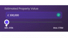
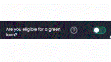
- CustomSwitch to render boolean attributes as a switch
- CustomSlider to render numeric attributes as a slider with an attached input as well
- CustomRadioList to render option set attributes as a radio list (not all the available option set items)
- CustomInputLabel to render numeric attributes in an input with an attached input label
- CustomButtonsList to render any attribute as a list of buttons
- CustomQuantityBtn to render numeric attributes as a quantity control (input with +/- buttons)
- CustomButtonsListOptions to render option sets as a list of buttons (all the available option set items)
- CustomButtonsListBool to render boolean attributes as a list of buttons (yes/no)
To use this library, first import it in the form where you want to render the custom controls:
let customControlLib = ebs.importClientScript("customControlsJourneyTemplate");Then create instances for the desired controls:
formScope.myAttributeControl = new customControlLib.CustomSwitch({});All the custom controls have been developed using either the DevExpress third-party library or using JavaScript and JQuery. All of them include the setOptions function, which is based on the available configurable options for the specific control (e.g.: step for the CustomSlider or onText for CustomSwitch).
| Custom Control | Option | Description |
|---|---|---|
| CustomSwitch | label | Control's label. |
| extra | Additional label displayed next to the switch. | |
| onText | Text for on-state label (default: "yes"). | |
| offText | Text for off-state label (default: "no"). | |
| Custom Slider | label | Control's label. |
| icon | Input icon. | |
| min | Slider's minimum value (default: 0). | |
| max | Slider's maximum value (default: 100). | |
| step | Slider's increment (default: 1). | |
| currency | Currency code for formatting the span's input and label (default: "EUR"). | |
| currencySymbol | Currency symbol for formatting the min and max labels of the span (default "€"). | |
| inputWidth | Width of the input control (default "10em"). | |
| isRealTime | Boolean set by default to false. When set to true, all the change handlers will be triggered every time you change the input. By default, the change handlers are triggered just when you drop the handle of the slider or when you input in the number box. This is useful if you cascade-calculate other values client-side based on the value of your attribute. | |
| CustomRadioList | listOptions | Array of strings containing the available options (default: ['Opti 1', 'Opti 2']). |
| listOptionsExtra | Array of strings containing additional labels for each option. | |
| CustomInputLabel | icon | Control's icon. |
| inputWidth | Width of the input control (default: "10em"). | |
| CustomButtonsList | label | Control's label. |
| btnLabels | Array of strings containing the available options (default: ['Opt 1', 'Opt 2', 'Opt 3']). | |
| CustomQuantityBtn | label | Control's label. |
| step | +/- increment (default: 1). | |
| CustomButtonsListOptions | label | Control's label. |
| CustomButtonsListBool | label | Control's label. |
| btnLabels | Array of objects containing the buttons' labels and values (default: [{label: 'Yes', value: true}, {label: 'No', value: false}]). |