UI Components
UI Components are reusable, configurable controls that you can add to your no-code journey screens through UI Designer. Each component appears in the left-side toolbar under a dedicated section, where you can browse available options by category and configure their properties in the right-side panel. Creating a UI Component requires writing a JavaScript class and optionally CSS — once built by a developer, journey designers can drag it from the toolbar and configure its properties in the right-side panel without writing any code. Once placed on a screen, the component renders at runtime and can bind to the journey's data model, so changes made by Logic Blocks or user interaction stay in sync automatically.
Create a UI Component
-
In Studio, go to Main Menu > Frontends > UI Components. The UI Components list opens.
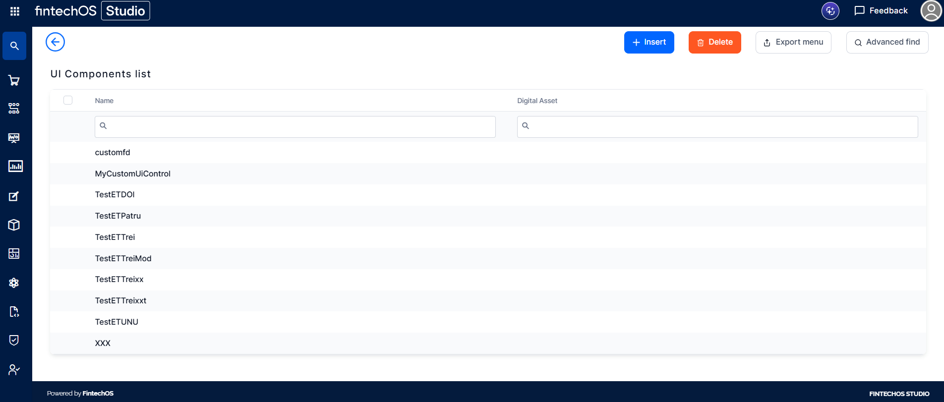
-
Click Insert to create a new component. Fill in the fields:
-
Metadata: A JSON object of type IUiComponentMd that defines the UI Component's behavior, appearance, and configurable properties, and is required when creating a component record in the backoffice. The key fields you need to fill in are:
-
name: a unique identifier for the component;
-
version: must follow the x.y.z format (for example, 1.0.0);
-
displayName: the label shown in UI Designer;
-
description: a short text displayed in UI Designer that tells journey designers what the component does (e.g., 'A demo custom widget'). It appears when browsing the list of available components;
-
category: an optional array of user-defined strings used in UI Designer for filtering (e.g., ['Only for demo', 'do not use']). It lets journey designers narrow down the component list by category in the left-side toolbar;
-
code: a JavaScript class that extends FtosUiComponentBase and implements a render() method;
-
options: the list of configurable properties shown in the right-side panel in UI Designer;
-
css: optional CSS scoped to your component.
-
-
Image: an image URL or Base64-encoded image used as a thumbnail when the component appears in the list of available UI Components in UI Designer. It helps journey designers visually identify the component at a glance.
-
Preview Image: an image URL or Base64-encoded image used as a placeholder rendered directly on the canvas in UI Designer when the component is placed on a screen. It gives designers a visual approximation of what the component will look like at runtime, before the actual component code executes.
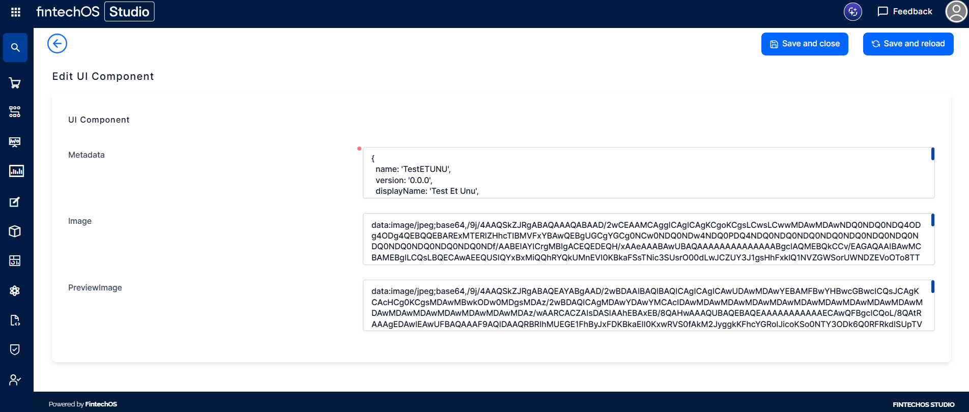
-
-
Click Save and Reload.
To add the UI component to a journey, follow the instructions on the UI Designer page.