Design the UI layout with containers
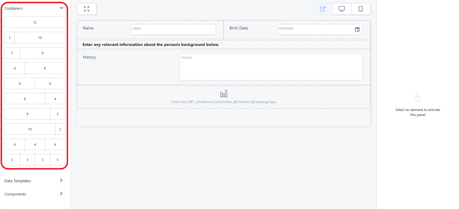
You can use the Containers in the UI Designer's left panel to position the content in each form section (row) using responsive design. Each container is divided based on a grid of 12 columns that are grouped together in various combinations to create wide or narrow cells (three 4-column cells, a 3-column cell next to a 9-column cell, two 6-column cells, etc.).
To add a row template to the interface, drag and drop its corresponding container from the left panel to the editor's working area (see Adding UI elements to the user interface). Each cell of the template allows you to place data fields, UI components, or even other row templates to further refine your page layout.
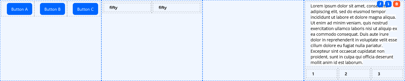
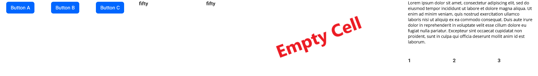
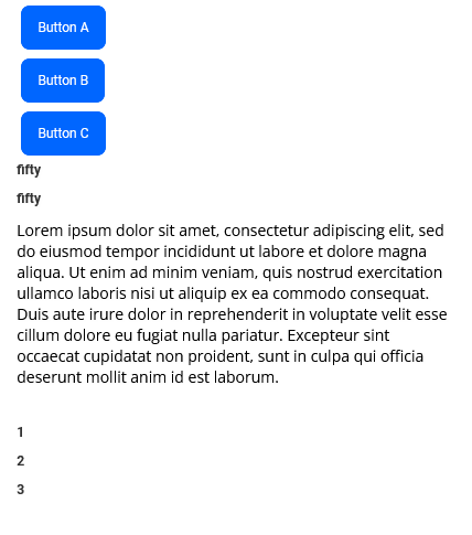
Cells on the same row template are responsive, which means they appear on the same line on desktop devices, but are rearranged one on top of the other on mobile devices. Empty cells take up space in desktop (horizontal) mode, but are collapsed in mobile (vertical) mode.
vs.
Collapsible Containers
A collapsible container is a variation of the one-column container that allows users to expand or collapse its content by clicking the arrow icon in the top-left corner. You can use them to manage screen space efficiently, organize information hierarchically, and allow users to control what they see.
After you add a collapsible container to the UI, while the container is selected, fill in its properties in the right panel:
- Title - Enter the text to be displayed at the top of the container. To provide translations for each platform language, click the translation button placed to the right of the title field. In this case, you must also specify a localization resource key (see below).
- Enter the resource key name that will store the localizable text - Enter a name for the resource key that will save this title in the Localization Resources page.
- Initial State - Choose whether the container should be expanded or collapsed by default.
- Additional CSS Classes - Add any CSS class names to style the container. These classes must be defined in one of the form's associated Style Sheets. You must press Space or Enter after typing each class name to confirm it.
Once configured, you can add content to the collapsible container just like any other container.