Add attributes to the UI
- In the UI Designer's left panel, from the Data Templates section, select a vertical or horizontal attribute template and drag it to the working area in the desired position. For more information, see Adding UI elements to the user interface.
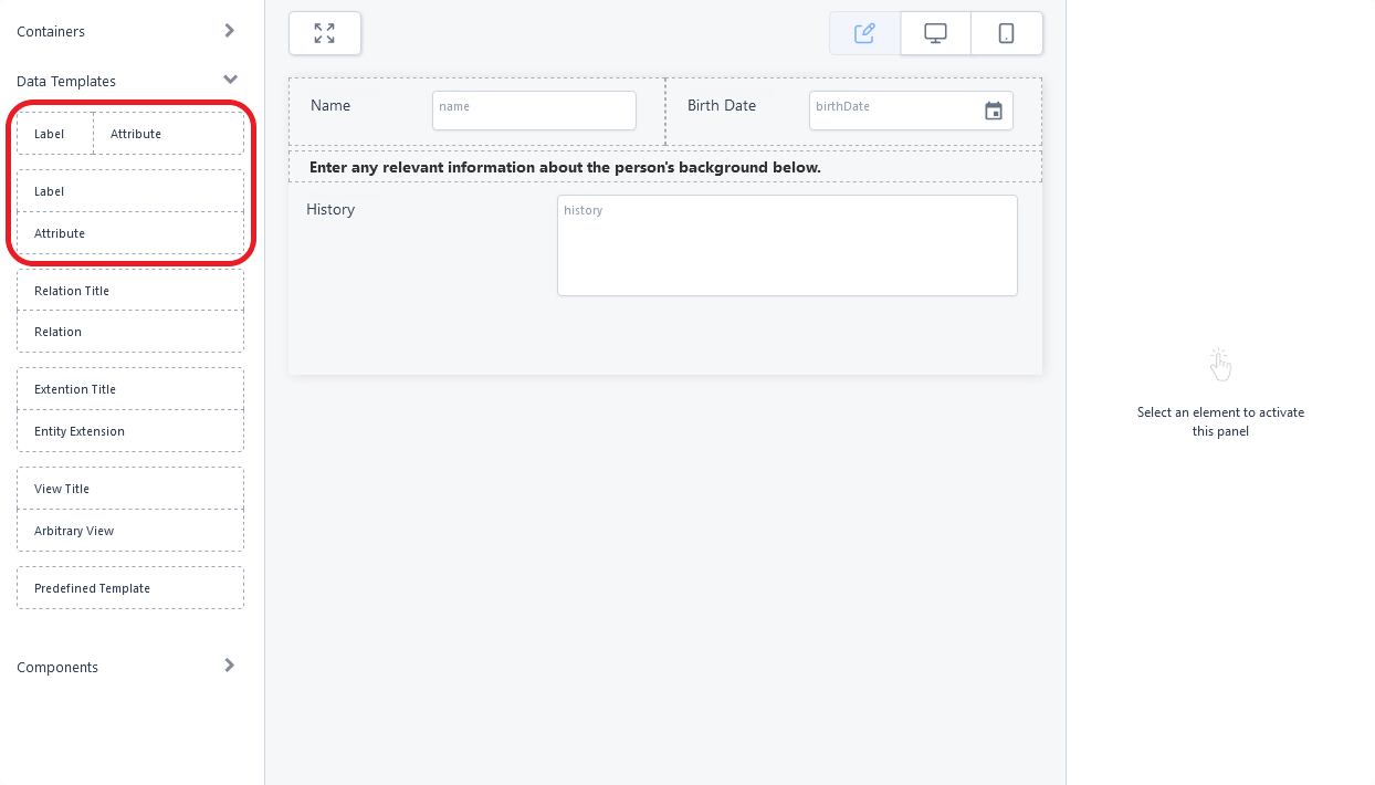
- While the attribute field is selected, fill in its properties in the right panel.
Property Description Select the Attribute Select the name of the attribute that you want to display.
The attribute must belong to the form's data model. Otherwise, select the ** Mockup Attribute ** option to temporarily create a field in the user interface that is not yet linked to an attribute.Select Label Type - default - The attribute's display name is used as a field label.
- custom - Manually enter the text for the field label. You can also manually add translations for each platform language, by clicking the toggle translation button placed in the Enter the desired text field. In this case, you also need to choose a name for the resource key that will save this text in the Localization Resources page.
- none - No label is displayed and no label space reserved in the user interface when rendering the attribute field.
Additional CSS classes Write any CSS class names you wish to apply to the field. The classes must be defined in one of the form's associated Style Sheets. NOTE
You must press Space or Enter after typing a class name to confirm it.Render field as hidden The element will not be visible in the user interface. This allows you to bring an attribute value in the form's context without displaying it (e.g.: to retrieve the value of a birth date attribute to calculate age).
IMPORTANT!
Hidden elements are still listed in the form's document object model. Do not disclose sensitive information in hidden fields.UI Control Allows you to customize the appearance of the attribute field. See Custom UI Controls. Fill in the Attribute Name (Mockup attributes only)
Enter a name for the mockup attribute.Add comma separated items (Mockup Custom List attributes only)
Allows you to populate a mockup list field manually.Select the Lookup Entity (Mockup Lookup attributes only)
Allows you to populate a mockup lookup field with a specific entity's primary attributes.Select the Option Set (Mockup Option Set attributes only)
Allows you to populate a mockup option set field with a specific option set's values. - Click Apply changes to save the field's properties.
- Click Save and reload to save the form.
To modify an attribute field, select it in the main area and edit its properties from the right panel.
To move an attribute in the user interface or to delete it, see Moving and deleting UI elements.
Custom UI Controls
Some attribute fields have a UI Control property which allows you to customize their appearance. Click the gear icon to select your customizations:
Custom UI Controls for Boolean Attributes (Non-Mockup)
- Default - Standard checkbox control.
- Ftos Switch - Toggle switch with the following options:
- Label - Text label for the switch.
- Extra - Optional text displayed between the label and the switch. The text is highlighted when the switch attribute value is set to True and grayed out when set to False
- On Text - Text displayed on the switch when the attribute value is True.
- Off Text - Text displayed on the switch when the attribute value is False.
- Ftos Button Switch Boolean - A pair of radio buttons with the following options:
- Use Radios - Displays a radio button selector inside each button.
- Label - Text label for the attribute field.
- True Label - Text displayed on the switch when the attribute value is True.
- False Label - Text displayed on the switch when the attribute value is False.
Custom UI Controls for Numeric and Whole Number Attributes (Non-Mockup)
- Default - Standard text box control.
- Ftos Slider - Text box bound to a slider with the following options:
- Label - Text label for the control. Includes a Translations button that allows you to provide translations for each platform language.
- Icon - HTML markup for additional visual elements such as formatted text or images. E.g.:
<i class="fa fa-percent" aria-hidden="true"></i> - Min - Minimum slider value (leftmost position).
- Max - Maximum slider value (rightmost position).
- Step - Value increment/decrement between slider positions.
- Currency Code - Allows you to display a currency symbol label based on the ISO 4217 standard.
- Input Width - CSS-compatible width specification for the control.
- Ftos Decorated Numeric - Text box with customizations for additional visuals and adjustable width:
- Icon - HTML markup for additional visual elements such as formatted text or images. E.g.:
<i class="fa fa-percent" aria-hidden="true"></i> - Input Width - CSS-compatible width specification for the control.
- Icon - HTML markup for additional visual elements such as formatted text or images. E.g.:
- Ftos Quantity Buttons - Spin box with increment/decrement buttons (+/-):
- Label - Text label for the control. Has a Translations button that allows you to provide translations for each platform language.
- Step - Value change per click on the +/- buttons.
- Input Width - CSS-compatible width specification for the control.
Custom UI Controls for Option Set Attributes (Non-Mockup)
- Default - Standard drop down box control.
- Ftos Button List - Radio buttons with the following options:
- Use Radios - Displays a radio button selector inside each button.
- Label - Text label for the control. Includes a Translations button that allows you to provide translations for each platform language.
- Items Extra Label - Additional label for each option displayed after the "Display Name" of the option.