Configure Field Options
Field options customize form fields behavior in order to build dynamic forms and user journeys. For instance, you can:
- Show tooltips with detailed descriptions for your form fields
- Make fields read-only to prevent modifications
- Mark mandatory fields as required
- Streamline the user experience with custom JavaScript code that executes when a field updates. For instance, you can show only relevant cities based on the selected country, automatically change an account currency based on the selected country, or show/hide CIF/CNP fields based on selected customer account type.
Form field options are applied only at the user interface level, not in the data model. For instance, marking an attribute field as required in a form driven flow, does not make the attribute mandatory in the entity's data model.
Customize Form Fields
To customize form fields for specific attributes, in the configuration page of the form driven flow, select the Field Options tab and click Insert to customize the field for a specific attribute. Then, fill in the corresponding settings for the field:
| Field | Description |
|---|---|
| Use Virtual Attribute | Tick when rendering fields for data extensions to make them available in the Attribute field. |
| Attribute | At the right-side of the Attribute field, click the drop-down and select the attribute for which you wish to customize the form field. This field is mandatory. |
| Show Tooltip | Inherit (default value). Inherits the tooltip show options selected on the General tab. If no options have been previously selected, the default will be User Settings, which means that the users will be able to show tooltips by toggling on / off the Tooltips button displayed at the top-right corner of the UI. NOTE The Tooltips toggle button is available in the Digital Experience Portal only when tooltips are available on the journey.
|
| Custom Tooltip | The text which will be shown in the tooltip in the Portal Ui. The tooltip text is localizable. NOTE The maximum length of the tooltip text is 500 characters. |
| Lookup View Name (Lookup attributes) |
Predefined view used to select values for the attribute. If no value is selected, the attribute's default view is used. |
| Lookup as DropDown (Lookup attributes) |
Display the lookup attribute values in a drop down grid instead of a separate grid window. |
| Lookup as Select Box (Lookup attributes) |
Display the lookup attribute values in a simplified list. The list doesn't have a header and contains only the values from the first column of the referenced entity’s data view. |
| Show Edit Button (Lookup attributes) |
Display the pencil button allowing you to edit the selected lookup attribute. |
| Lookup Edit Form (Lookup attributes) |
Predefined form used to edit the selected lookup attribute. If no value is selected, the attribute's default edit form is used. |
| Lookup Show Insert Button (Lookup attributes) |
If the lookup attribute is selected from a grid window, not from a drop down list, the grid will not include the Insert button (you will not be able to add new lookup attribute records). |
| Field is Read Only | The field will be non-editable. |
| Field Required Level | The Required Level drop-down allows you to choose if a specific attribute (field) is to be mandatory, recommended or optional:
|
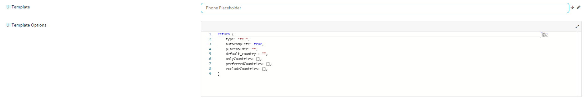
| UI Template | Allows you to select a placeholder for either email or phone. Select the template available for your attribute. After the selection is done, a HTML code will be displayed.
|
| Order Option Set Items (Option Set attributes) |
|
| Open Calendar on Click (Date, DateTime, and Invariant Date attributes) |
|
| Placeholder (Date, DateTime, and Invariant Date attributes) |
Displays a temporary grayed out text in the input field when empty. Allows you to provide a hint or example of the expected input format or type of data (e.g. DD/MM/YYYY). |
| Validation Message Mode (Date, DateTime, and Invariant Date attributes) |
|
| Use Mask Behavior (Date, DateTime, and Invariant Date attributes) |
This option is applicable only if Open Calendar on Click (Date, DateTime, and Invariant Date attributes) is disabled. Allows the user to enter a date or time using keyboard navigation:
|
| Minimum Value (Numeric attributes) |
The smallest number that can be entered in the field. |
| Minimum Value (Date or DateTime attributes) |
The earliest date allowed. Prior dates are disabled in the date picker and trigger an error if entered using the keyboard.
|
| Maximum Value (Numeric attributes) |
The largest number that can be entered in the field. |
| Maximum Value (Date or DateTime attributes) |
The latest date allowed. Later dates are disabled in the date picker and trigger an error if entered using the keyboard.
|
| File Open (File attributes) |
Allows you to set the option to either preview or download the files on your computer. If you select the Open&Download option, click on the document to choose between opening the file or downloading it on your computer.
|
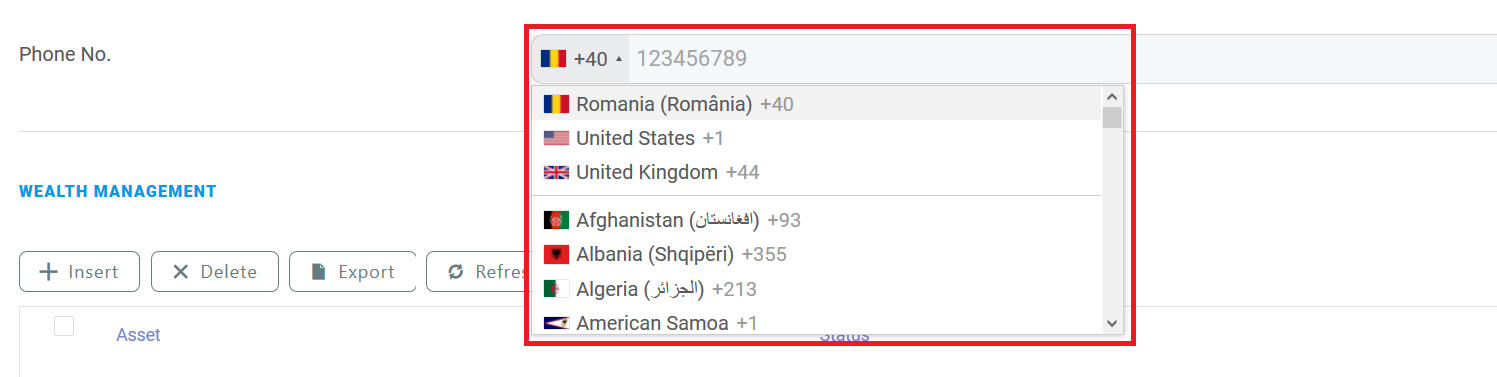
| UI Template Options | This field is shown only if the UI Template is selected. You can customize the selected placeholder by modifying the code based on your preferences. For the Phone Placeholder UI templates, the following options are available:
For instance, the template options below Copy will create the following field:
|
| Attribute Change Event | Code to be executed each time a form field is updated. For instance, you can dynamically populate a lookup field based on the value selected in another field. For more information, see Configure Field Rules. |
Configure Field Rules
To create field rules, on the entity linked to your form driven flow, you should have at least two attributes defined, one for the condition and the second for the action. For example, if you want to display relevant cities based on the selected country, on the accountInsertForm digital journey of the account entity, you have to add the country field and the city field on which you define the action (where both fields are lookup fields). If the data form does not have the two fields, add them.
1 Add field for action
Configure the field used as filtering criterion (eg. country) as described in the Customize Form Fields section.
2 Add field for condition
Add the field which is filtered (e.g., city) and configure it as described in the Customize Form Fields section.
Then, in the Attribute Change Event field, provide the piece of code to be executed each time the lookup value of the country field changes, for instance:
var accountCountryId = ebs.getFormAttributeValue("ebsContainerContent", "Country")
ebs.getByQuery({
        entity: {
                alias: "a",
                name: "accountCountryId",
                attributelist: [
                        {
                        name: "Cities",
                        }
            ]
        },
        "where": {
            "type": "and",
            conditionlist: [
                        {
                        first: "a.accountCountryId",
                        type: "equals",
                        second: "val("+ accountCountryId +")"
                        }
                    ]
        },
function(e){
        if(e.Records != null && e.Records != undefined && e.Records.length > 0)
            {
            ebs.setFormAttributeValue("ebsContainerContent", e.Records[0].a_accountCountryId);
            }
})
Save the field, then save the form driven flow.
In the user interface, each time you select a country, the list of cities will include only cities that belong to that country (i.e., the cities relevant for the country).