Adding Attributes
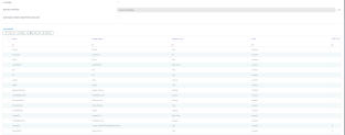
To add new custom attributes to an entity, from the Edit Business Entity page, expand the Data Model section by clicking on it, then click the Insert button. The Add Attribute page appears where you will provide the properties.
Based on the attribute type you select from the Attribute Type drop-down list, you need to provide details corresponding to that specific attribute. For more information, see the Types of Attributes.
This is the generic list of properties you need to provide when adding a new attribute (field).
| Property | Description |
|---|---|
| Name | The name of the attribute. This is used to identify the attribute in the data model when you design the user interface, for instance to specify which attribute is displayed in a specific field. NOTE A naming convention is an important part in a well-built data model; therefore, we recommend you to use PascalCaseNames (upper camel), except for the first letter. The Name starts with a lowercase letter and all additional words start with an uppercase letter. Example: accountId. |
| Attribute Type | From the drop-down list, select the type of attribute you want to add. |
| Display Name | The name of the attribute that will be displayed on the data form in the user interface. You can overwrite the Display Name using other commands directly in the HTML data form. |
|
Description |
Insert the proper description. |
|
Tooltip |
Insert the tooltip to be displayed. The message inserted here will show when the user will hover over the attribute in the FintechOS Portal. Tooltips can be a powerful UI pattern which help you guide your users to take specific actions within the product; thus, enhancing the user experience. If tooltips are activated on data form driven flows, for all attributes to which you want to show tooltips in the Digital Experience Portal, in the Tooltip field, provide the tooltip text. Optionally, you can add tooltips to specific attributes which can be shown in the Portal UI on data form driven flows. |
|
TabelColumnName |
This is the name of the table column. |
| Required Level | From the Required Level drop-down list you can choose if a specific attribute (field) is going to be mandatory, recommended or optional:
NOTE
|
|
isReadonly |
The attribute is readonly if true, i.e. the front-end user will not be able to insert any data in this attribute. |
| Allows you to control access to the attribute using security roles. When this flag is checked, access to the attribute is restricted by default to all user roles except the administrator. To allow access to a secured attribute, you will have to explicitly configure security roles for this purpose (see Creating Security Roles for details). NOTE This option is disabled for system-generated attributes. |
Well-designed onboarding is vital for streamlining the user experience. Imagine users being lost within the app, having no clue what specific items on the UI mean or what actions they should take. If only they had the possibility to hover over specific fields and see some tips on what they should be doing.
Always make sure to save your configurations by clicking one of the save icons displayed on the top-right corner of the page.
