Configuring Field Options
Using field options enables you to build dynamic forms and user journeys. This feature allows you customize the fields displayed in the user interface and to create rules which apply to specific fields based on how users have filled out other fields in the form driven flow: show field values, show or hide specific fields, etc.
Customizing the user experience by using field options ensures that users always see the fields that are relevant to them.
Some use case scenarios for using this feature:
- Show relevant cities based on selected country
- Automatically change the account currency based on selected country
- Show CIF/CNP fields based on selected customer account type.
This section walks you through the prerequisites and the steps that you need to follow customize form fields and to create a field rule.
How to Customize Form Fields
To customize form fields for specific attributes, in the configuration page of the form driven flow, select the Field Options tab and click the Insert button to customize the field for a specific attribute. Then, fill in the corresponding settings for the field:
| Field | Description |
|---|---|
| Use Virtual Attribute | Tick when rendering fields for data extensions. |
| Attribute | At the right-side of the Attribute field, click the drop-down and select the attribute for which you wish to customize the form field. This field is mandatory. |
| Show Tooltip | Inherit (default value). Inherits the tooltip show options selected on the General tab. If no options have been previously selected the default will be User Settings, which means that the users will be able to show tooltips by toggling on / off the Tooltips button displayed at the top-right corner of the UI. NOTE The Tooltips toggle button is available in the Digital Experience Portal only when tooltips are available on the journey.
|
| Custom Tooltip | The text which will be shown in the tooltip in the Portal Ui. The tooltip text is localizable. NOTE The maximum length of the tooltip text is 500 characters. |
| Lookup View Name | Lookup attributes only! Predefined view used to select values for the attribute. If no value is selected, the attribute's default view is used. |
| Lookup as DropDown | Lookup attributes only! Display the lookup attribute values in a drop down list instead of a separate grid window. |
| Show Edit Button | Lookup attributes only! Display the pencil button allowing you to edit the selected lookup attribute. |
| Lookup Edit Form | Lookup attributes only! Predefined form used to edit the selected lookup attribute. If no value is selected, the attribute's default edit form is used. |
| Lookup Show Insert Button | Lookup attributes only! If the lookup attribute is selected from a grid window, not from a drop down list, the grid will not include the Insert button (you will not be able to add new lookup attribute records). |
| On File Upload Error | Attribute of type file only! Allows execution of a client side script if the file upload fails. |
| Field is Read Only | The field will be non-editable. |
| Field Required Level | The Required Level drop-down allows you to choose if a specific attribute (field) is to be mandatory, recommended or optional:
|
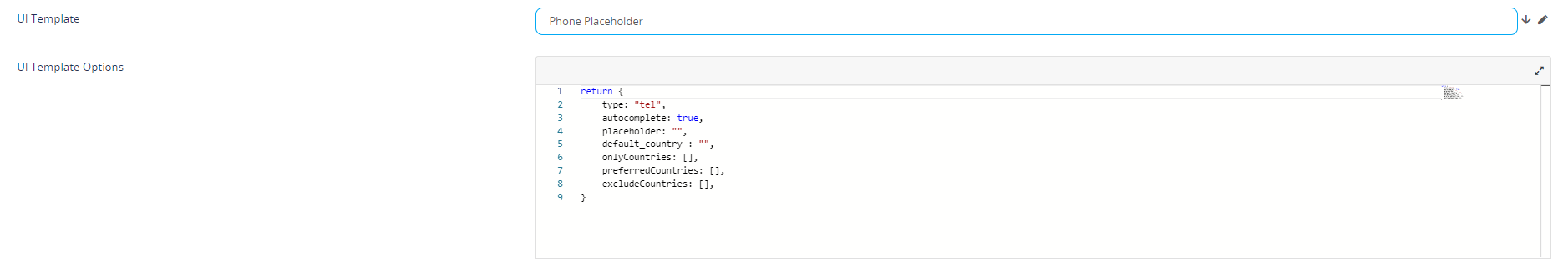
| UI Template | Allows you to select placeholder for either email or phone. Select the template available for your attribute. After the selection is done, a HTML code will be displayed.
|
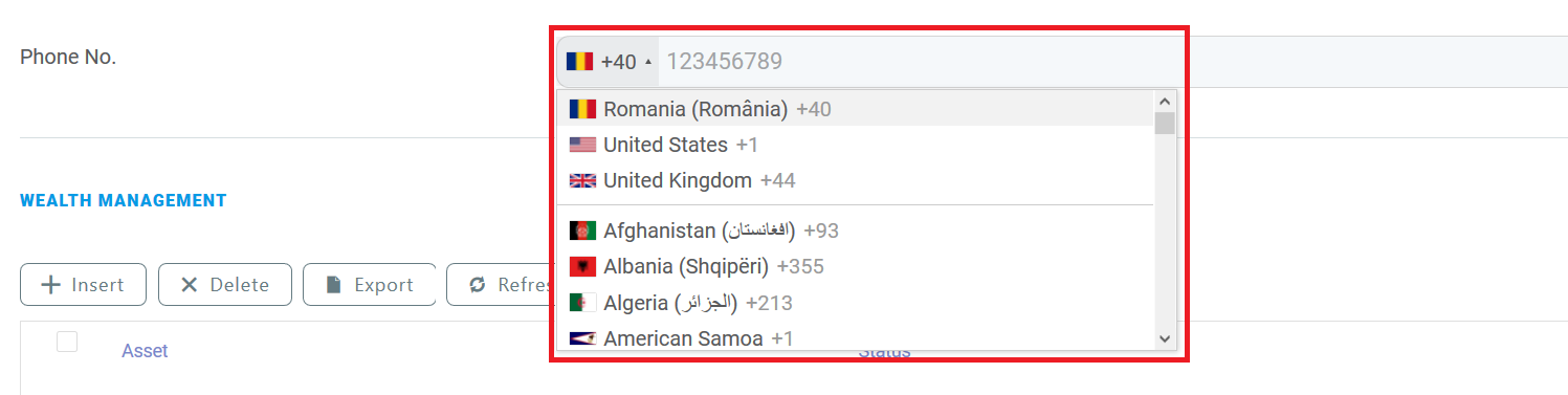
| UI Template Options | This field is shown only if the UI Template is selected. You can customize the selected placeholder by modifying the code based on your preferences. For the Phone Placeholder UI templates, the following options are available:
For instance, the template options below Copy will create the following field:
|
| Attribute Change Event | Code to be executed each time a form field is updated. For instance, you can dynamically populate a lookup field based on the value selected in another field. For more information, see How to Configure Field Rules. |
How to Configure Field Rules
To create field rules, on the entity linked to your form driven flow, you should have at least two attributes defined, onefor the condition and the second for the action. For example, if you want to display relevant cities based on the selected country, on the accountInsertForm digital journey of the account entity, you have to add the country field and the city field on which you define the action (where both fields are lookup fields). If the data form does not have the two fields, add them.
1 Add field for action
Configure the field used as filtering criterion (eg. country) as described in the How to Customize Form Fields section.
2 Add field for condition
Add the field which is filtered (e.g., city) and configure it as described in the How to Customize Form Fields section.
Then, in the Attribute Chagne Event field, provide the piece of code to be executed each time the lookup value of the country field changes, for instance:
var accountCountryId = ebs.getFormAttributeValue("ebsContainerContent", "Country")
ebs.getByQuery({
        entity: {
                alias: "a",
                name: "accountCountryId",
                attributelist: [
                        {
                        name: "Cities",
                        }
            ]
        },
        "where": {
            "type": "and",
            conditionlist: [
                        {
                        first: "a.accountCountryId",
                        type: "equals",
                        second: "val("+ accountCountryId +")"
                        }
                    ]
        },
function(e){
        if(e.Records != null && e.Records != undefined && e.Records.length > 0)
            {
            ebs.setFormAttributeValue("ebsContainerContent", e.Records[0].a_accountCountryId);
            }
})
Save the field, then save the form driven flow.
In the user interface, each time you select a country, the list of cities will include only cities that belong to that country (i.e., the cities relevant for the country).