
Configuring Field Options
Using field options enables you to build dynamic forms and user journeys. This feature allows you to create rules which apply to specific fields based on how users have filled out other fields in the digital journey: show field values, show or hide specific fields.
Customizing the user experience by using field options ensures that users will always see the fields that are relevant to them.
Some use case scenarios for using this feature:
- Show relevant cities based on selected country
- Automatically change the account currency based on selected country
- Show CIF/CNP fields based on selected customer account type.
This section walks you through the prerequisites and the steps that you need to follow to create a field rule.
How to Configure Field Options
To create a field rule, on the configuration page of the form driven flow, click the Fields Options tab. The list of fields existing on the journey (if any) appears.
Prerequisite
On the entity linked to your form driven flow, you should have at least two attributes defined, one for the one for the condition and the second one for the action. For example, if you want to display relevant cities based on the selected value of the country, on the accountInsertForm digital journey of the account entity, you have to add the country field and the city field on which you define the action (where both fields are lookup fields). If the data form does not have the two fields, add them.
STEP 1. Add field for action
- On the configuration page of the form driven flow, click the Fields Options tab. The list of fields existing on the journey (if any) appears.
- Click the Insert button. The Add Entity Form Field page appears.
- Provide at least the mandatory fields. Using the fields available in this page you provide extensive customization for the lookup fields.
- YES. Always show tooltips in the Portal UI on forms and user journeys when users hover their mouse on the attributes on fields which have tooltips. The users do not have the possibility to toggle the tooltips off.
- No. Never show tooltips in the Portal UI on the data form / digital journey. The users do not have the possibility to toggle the tooltips on.
- None – The field is optional. No error message will be displayed if the field is empty.
- Recommended – A blue dot will be displayed on the upper-left corner of the field in the user interface to indicate that it might be useful to fill in the field.
- Required - A red dot will be displayed on the upper-left corner of the field in the user interface to indicate that it is a mandatory field. The end user will not be able to add a new record if the field will be left blank.
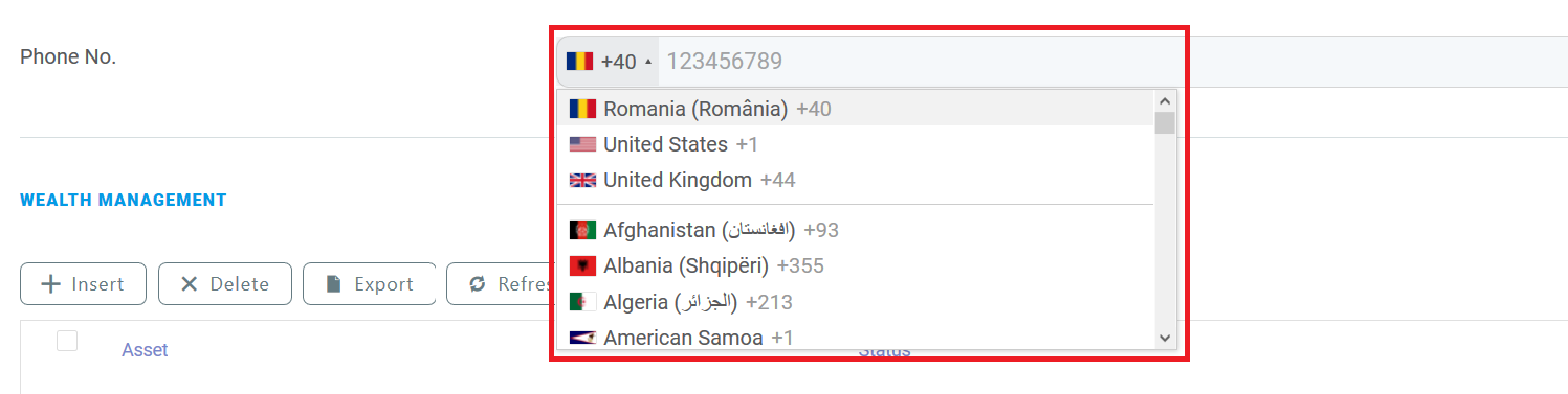
- type – "tel"
- autocomplete – true/false. Selects the use of the browser's autocomplete feature.
- placeholder – Displays a grayed out value for exemplification purposes when the field is empty.
- default_country – Phone number format based on the ISO 3166-1 aplha-2 country codes used by default.
- onlyCountries – List of allowed phone number formats based on the ISO 3166-1 aplha-2 country codes. When empty, all country-specific phone number formats are available.
- preferredCountries – Phone number formats based on the ISO 3166-1 aplha-2 country codes displayed at the top of the list.
- excludeCountries – Phone number formats based on the ISO 3166-1 aplha-2 country codes excluded from the list.
- Save the field once you finish customizing it.
| Field | Description |
|---|---|
| Use Virtual Attribute | Tick only when rendering data extensions. |
| Attribute | At the right-side of the Attribute field, click the drop-down. The list of attributes existing on the journey will be displayed. Select the desired lookup field and double-click on it. This field is mandatory. |
| Show Tooltip | Inherit (default value). Inherits the tooltip show options selected on the General tab. If no options have been previously selected the default will be User Settings, which means that the users will be able to show tooltips by toggling on / off the Tooltips button displayed at the top-right corner of the UI. NOTE The Tooltips toggle button is available in the Digital Experience Portal only when tooltips are available on the journey. |
| Custom Tooltip | The text which will be shown in the tooltip in the Portal Ui. The tooltip text is localizable. NOTE The maximum length of the tooltip text is 500 characters. |
| Field is Read Only | The field will be non-editable. |
| Field Required Level | The Required Level drop-down allows you to choose if a specific attribute (field) is to be mandatory, recommended or optional: |
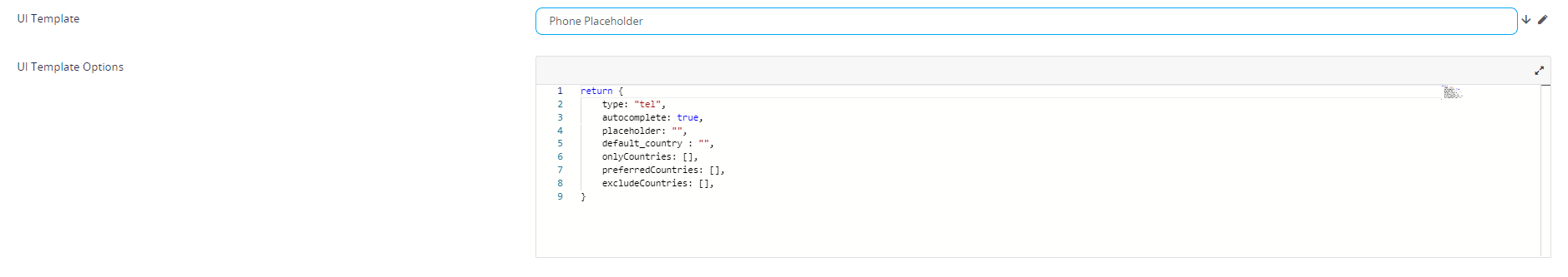
| UI Template | Allows you to select placeholder for either email or phone. |
| UI Template Options | This field is shown only if the UI Template is selected. You can customize the selected placeholder by modifying the code based on your preferences. For the Phone Placeholder UI templates, the following options are available: For instance, the template options below Copy will create the following field:
|
STEP 2. Add field for condition
Add the second field on which you will perform the condition (e.g., city).
| Field | Description |
|---|---|
| Use Virtual Attribute | Tick only when rendering data extensions. |
| Attribute | At the right-side of the Attribute field, click the drop-down. The list of attributes existing on the journey will be displayed. Select the desired lookup field and double-click on it. This field is mandatory. |
| Show Tooltip | Inherit (default value). Inherits the tooltip show options selected on the General tab. If no options have been previously selected the default will be User Settings, which means that the users will be able to show tooltips by toggling on / off the Tooltips button displayed at the top-right corner of the UI. NOTE The Tooltips toggle button is available in the Portal UI only when tooltips are available on the journey.
|
| Custom Tooltip | The text which will be shown in the tooltip in the Portal Ui. The tooltip text is localizable. NOTE The maximum length of the tooltip text is 500 characters. |
| Field is Read Only | The field will be non-editable. |
| Field Required Level | The Required Level drop-down allows you to choose if a specific attribute (field) is to be mandatory, recommended or optional:
|
| UI Template |
Select the template available for your attribute. After the selection is done, a HTML code will be displayed.
|
| Attribute Change Event | Provide the piece of code which will be executed each time when the lookup value of the other field is changed (in our example, the value of the country field). |
Code to display cities based on selected country
var accountCountryId = ebs.getFormAttributeValue("ebsContainerContent", "Country")
ebs.getByQuery({
		entity: {
				alias: "a",
				name: "accountCountryId",
				attributelist: [
						{
						name: "Cities",
						}
			]
		},
"where": {
"type": "and",
			conditionlist: [
						{
						first: "a.accountCountryId",
						type: "equals",
						second: "val("+ accountCountryId +")"
						}
					]
		},
function(e){
if(e.Records != null && e.Records != undefined && e.Records.length > 0)
			{
			ebs.setFormAttributeValue("ebsContainerContent", e.Records[0].a_accountCountryId);
			}
})
Save the field, then save the form driven flow.
In the portal, when adding customers, after selecting the Country, in the City field users will see only the cities which belong to that country (i.e., the cities relevant for the country).